


human-in-the-loop agentic workflows
role
User Experience Design Lead, UX Research
team
ML, Engineering, Product, Data, SME
skills
Product Design · Systems Thinking · Evaluation Criteria · Design Systems · Research
overview
How do you trust the work you didn't write?
Ontra DDQ is built for fund managers at private equity and private markets firms running active fundraising, operational and ESG reporting cycles. A due diligence questionnaire is the structured document a limited partner sends them to assess investment strategy, operations, compliance practices and ESG policies before committing capital.
Ontra already used AI to draft those answers and people mostly didn't use the drafts.
Systems mapping
I started from the business outcome and worked backward to the moments people were dropping out.
Assumption testing
Every assumption got a test and the two that could have killed the whole approach went to technical spikes first.
Agent behavior design
What the agent does on its own, what it shows you about its thinking and where a person has to stay involved.
Design system
Native AI components built for the new workflow, from the response card to its reasoning and status, made to carry across the rest of the products.
Prototyping and testing
Putting working prototypes in front of users, because agent behavior only shows itself once it is running.
Co-development program
Continuously iterating on concepts and validating product decisions.
problem
The feature built to save time had become another step inside it.
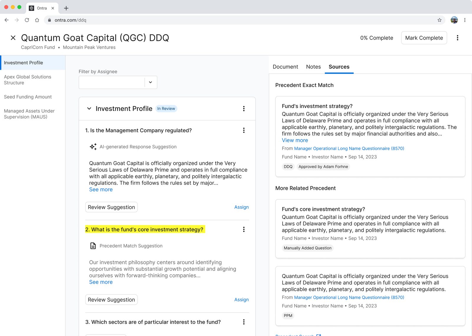
When the precedent library had something relevant, the product drafted an answer and attached its reasoning and sources. It showed about four lines of that answer behind a "see more," and only for the question you were working on.
Four lines isn't enough to tell if a legal answer is right. When a suggestion was wrong, people opened precedent search, a separate page behind an external link, and looked for the source themselves.
That search took days per questionnaire and up to 90 minutes for one hard question. It was the most frequent pain point in the product and the main reason people abandoned a DDQ halfway through.
Nobody could see where the work stood
Progress was one percentage across a document several people were editing at once. An empty question, a drafted one and an approved one all looked the same from outside.
The real document didn't exist in the product
People worked in a flat list of questions, answers and comments. The version the investor would actually get only existed after you exported it and it came out with no formatting.
key design moments
Show the whole answer, or keep the list short?
Four lines behind a "see more" keeps a long questionnaire easy to skim and that is why it was built that way. People opened every question anyway. They were not skimming, they were deciding whether to put their name on an answer. I showed every response in full and took the longer page.
Why does the preview get half the screen?
It had about half and I could not find a reason for it. The questions and answers are the work, so they took most of the space. Reasoning, sources and notes moved into the response card, which ended the trip to the side panel on every question.
Should the agent walk people through the work?
A lot of agent products take you one step at a time and we did not do that. The agent drafts the document, so you open it mostly written and the job is review. Everything after the draft is a person, and the agent never sends anything to the investor.
One status field, or two?
Whether an answer is approved and where it came from are two different things. An AI-generated answer marked Approved and a human-written one marked Approved are not the same object. So a question carries a status (Draft, In Review, Approved, Flagged) and a separate source label (AI-Generated, AI-Match, Need Input).
what shipped
A loop instead of a handoff
You open a document the agent has already drafted, read an answer, read the reasoning behind it and send it back to be rewritten with instructions. Including specific ones, like using the exact wording from a particular source.
Reasoning where the answer is
Reasoning, sources and notes sit inside the response card.
Filtering by who has what
Sort the questions by response type, assignee or review stage, so an owner can see what's outstanding and who's holding it.
Progress by state
Counts of what's approved, flagged and needs input, plus a summary of the document. The single percentage is gone.
Live preview in the original format
The investor-facing document renders as you work, so you can see what you're actually producing.
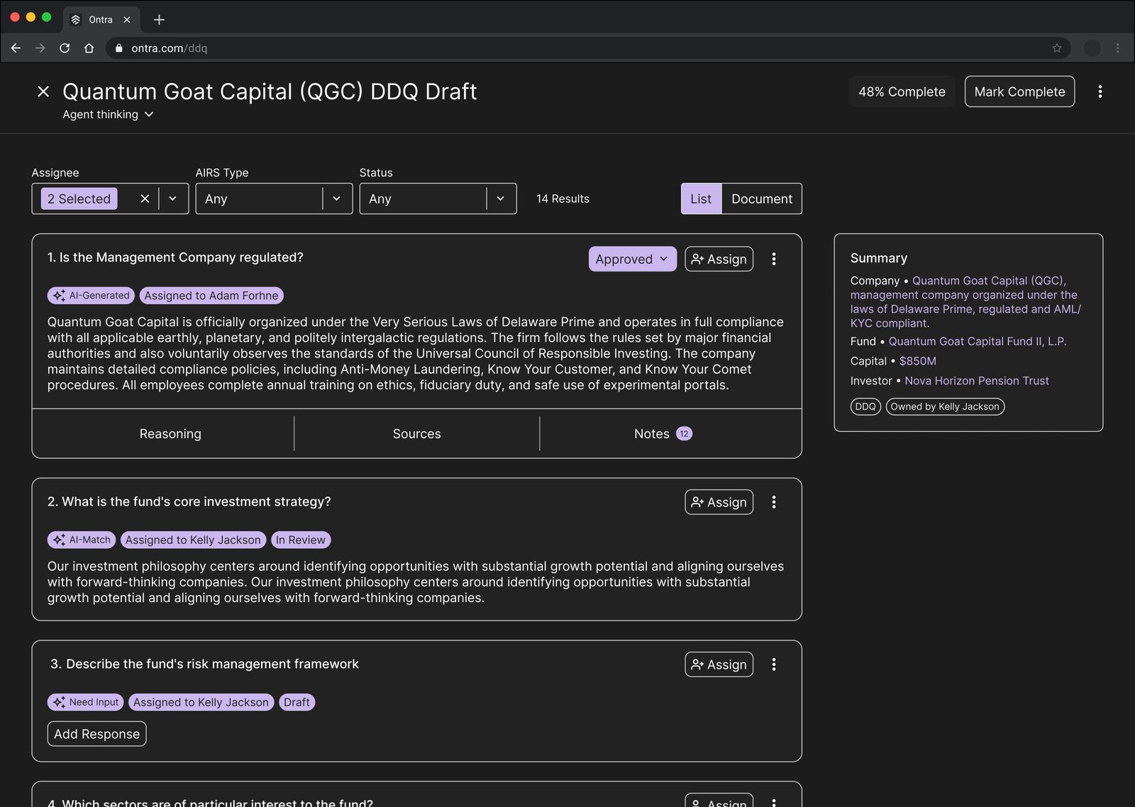
Not an actual design. Confidentiality obligations restrict me from sharing more.Please do reach out and I'd be happy to walk you through my process.
impact
95(%)
Of suggestions applied without edits
It came from two things at once: the suggestions themselves got better and the design made it possible to tell whether a suggestion was worth applying.
Why this mattered
The product already had AI. It had been drafting answers for a while and people were working around it, spending up to 90 minutes finding a source themselves for a question the system had already answered.
So the gap was never only model quality. Nothing about the draft gave anyone a reason to rely on it. Showing the full answer, putting the reasoning next to it and separating what was approved from what was only drafted is what changed it from a feature people skipped into something they work inside.
tradeoffs
Showing every answer in full makes a heavy page
Expanding all the responses is what makes them reviewable. It also makes a long questionnaire a very long page, so the filters carry more weight.
Export fidelity isn't solved
Complex investor templates with merged cells, nested tables and attachments don't come back out cleanly. We wrote it down as a known limitation instead of designing around it.
reflection
People didn't mind the AI. They minded not knowing where it made a decision.
I expected more resistance to AI-written answers than I got. What people actually reacted to was not being able to tell which parts of the document the system had made a call on and whether they could take that call back.
That's why the statuses and the source labels ended up mattering more than how well the agent wrote. Seeing where a decision was made and being able to undo it is what made the drafts usable.
Override should be a conversation
The next thing I mapped was a concept I called Boost Reasoning. Instead of replacing an answer, you point the agent at the mistake or at the direction you want and it rethinks and produces a new suggestion. That keeps the work with the agent and the judgment with the person, which is closer to what people were asking for than handing them a blank field.
retail control tower digital twin
company
IBM
role
Senior Product Designer
team
Product and Design, Data and AI, Business Analysts, SMEs
context
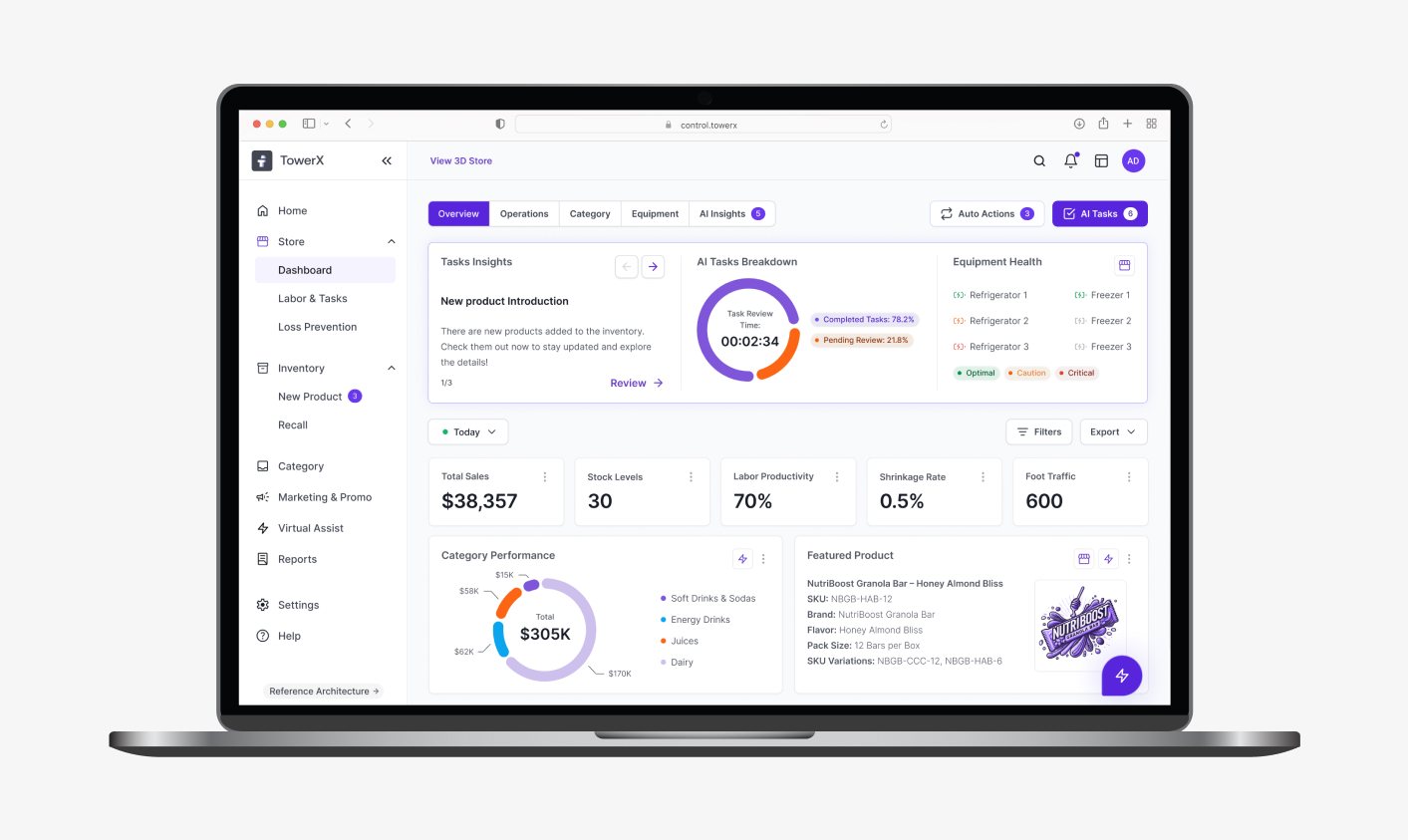
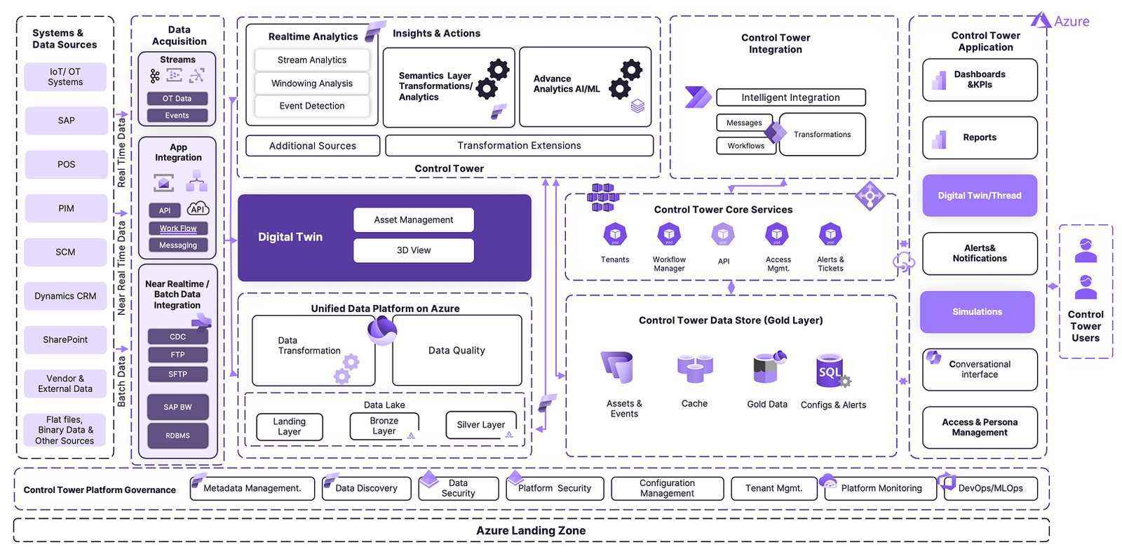
An operational control tower integrating all store systems, mapping the live state of inventory, workforce, promotions and equipment.
the big idea
A digital twin of store operations: predictive and prescriptive analytics, action-oriented dashboards and GenAI and agentic AI handling automation and recommendations. One live model of what is actually happening across a retail estate and what to do about it.
why it mattered
Retail operations ran across seven or more disconnected systems. There was no unified view of the estate, so decisions waited on someone reconciling numbers by hand. The cost of that latency is not subtle.
$1T
Global stockout losses, per year
25%
Promotion ROI lost
8%
Annual shrink from spoilage
7+
Disconnected systems
discovery
AI in retail isn't about replacing people. It's about freeing them from chaos so they can focus on the moments that matter.
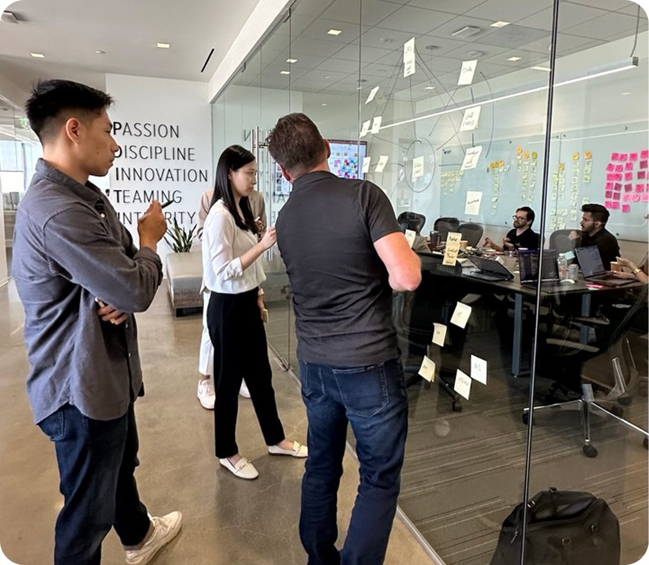
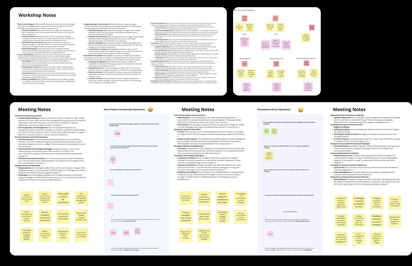
We ran 21 stakeholder interviews and mapped 15 workflow issues across the estate, working with a core team of product and design, data and AI, business analysts and subject matter experts. Three numbers set the agenda: 6.4 hours a week lost to manual data checks, promotions executing at 62% of the planned layout and maintenance alerts routinely arriving more than two hours late.
Two views of the same problem came out of it. Store managers described manual reconciliation across disconnected apps, no real-time inventory data and issues surfacing only once revenue had already moved. The business side described the same gap from above: no real-time operational oversight, delayed alerts and no predictive KPIs at all.
defining the work
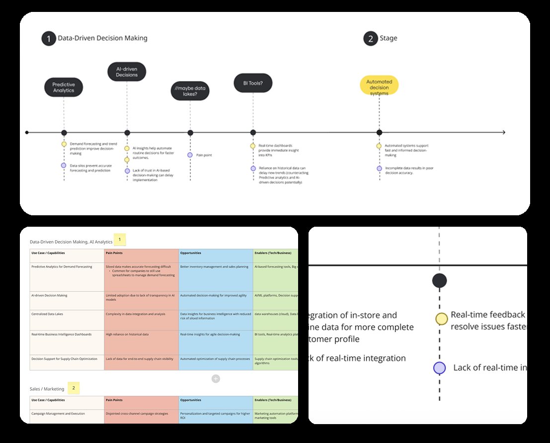
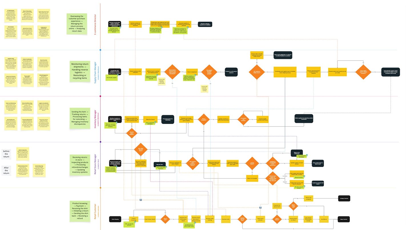
Five personas came out of the research, along with their responsibilities and where they depend on each other. What they needed was consistent: a consolidated task and alert view, live execution tracking with ROI attached and SKU-level predictive restocking.
We prioritized use cases that were both high-frequency and measurable. New product launches were taking an average of four days from SKU creation. Overstock write-offs ran about $1.2M a year. Equipment downtime sat between 8 and 12 hours per incident.
The information architecture settled into three tiers, Store Ops, Inventory and Promotions, with an AI assistant layer running across all of them. That structure answered two findings directly: people needed 8 to 12 clicks to find a report and 75% of tickets were being raised outside the system entirely, where nothing could track them.
design principles
Focus on user data. The screen leads with what this person is accountable for. Everything else the system knows stays out of the way.
Simplicity and clarity. A prediction nobody can read is not a prediction. Every recommendation states what it is proposing and what happens next.
Universal accessibility. The tower runs in back rooms and on shop floors, on whatever hardware is there.
prototyping and testing
Four design sprints, interactive prototypes and 10 end users in the feedback cycles. Testing ran against real operational scenarios rather than a happy path, because the cases that matter in a control tower are the ones where something has already gone wrong.
the product
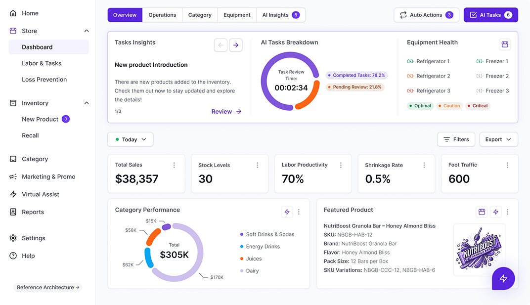
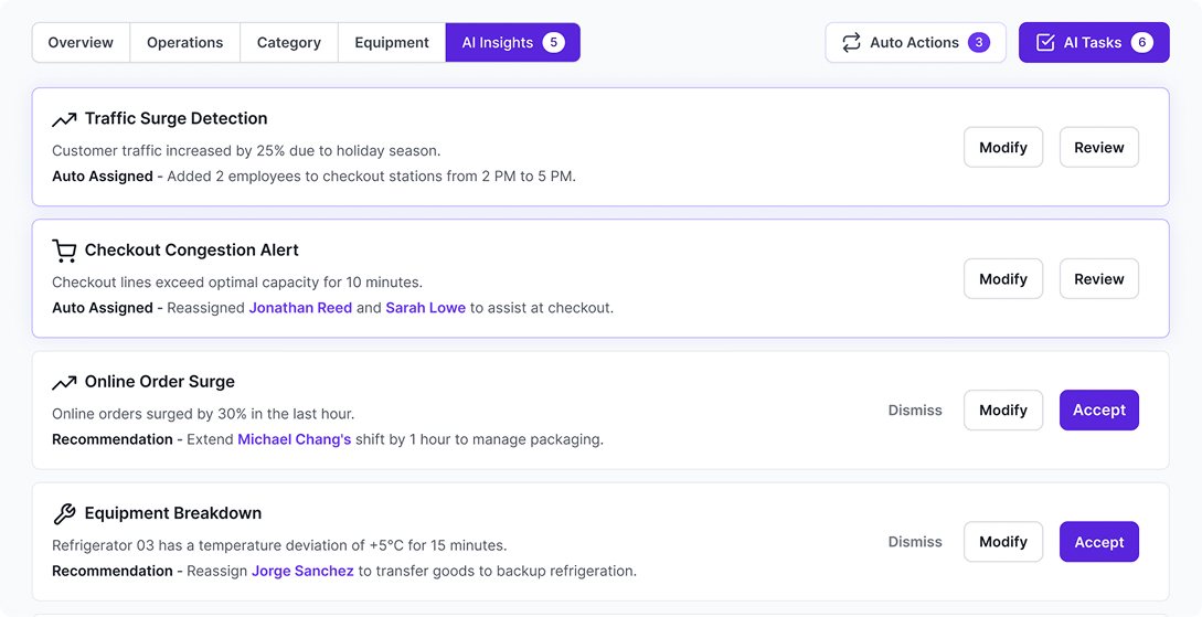
A modular dashboard tracking stock, promotions and equipment health in real time, with predictive restocking and spoilage alerts and a central place to assign work and talk about it. The AI layer runs a loop: predict, recommend, automate, measure. Predictive models sit underneath, a recommendation engine proposes and agentic AI carries out what has been approved.
The recommendation pattern is where the loop becomes visible. When the system detects an event, say 400 units returned in one region with restocking cost exceeding a $10K limit, it does not simply raise an alarm. It states the issue, offers specific actions and lets the user preview the outcome of each before confirming one. Pause restock, sell down the excess in four named stores, or keep stock in place. The user chooses and the agent executes.
results
30↓(%)
Time to set up a new product
22↑(%)
Promotion execution accuracy
Stockouts and overstocks both came down, as did downtime from equipment failures. The qualitative shift was larger than the numbers: managers reported lower cognitive load, teams coordinated through one dashboard rather than around it and trust in the predictive data grew far enough that operations moved from reacting to anticipating.
what comes next
The 90-day plan focuses on adoption rather than new surface area. The first month is usage analytics and a feature adoption audit. The second adapts the interface to user proficiency and extends seasonal forecasting. The third adds AR-assisted in-store visualization and closes an enterprise feedback loop back into the AI model.
multi-agent workflow
Designing AI agents experience for omnichannel response automation
company
IBM
role
Research, UX UI
why
The insurance and legal industries face significant challenges in dispute management, where traditional manual processes create delays, inaccuracies and compliance risks.
how
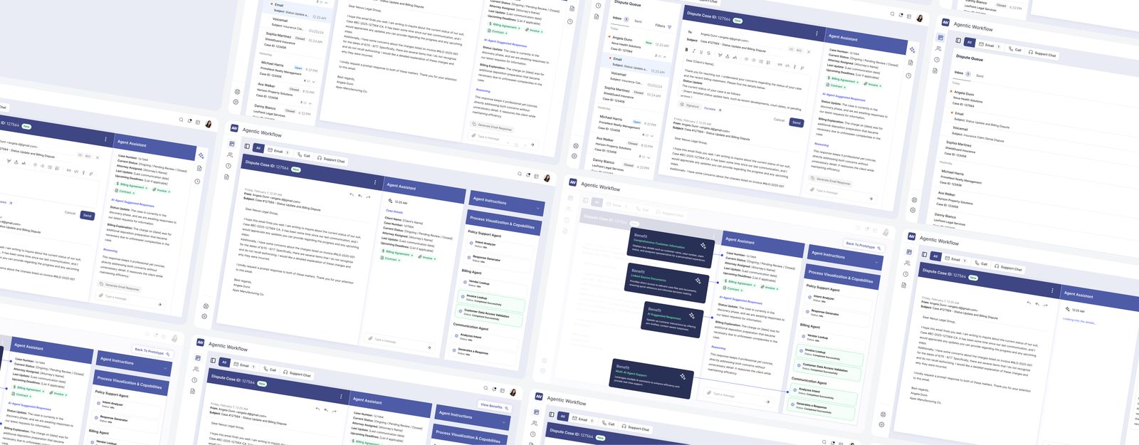
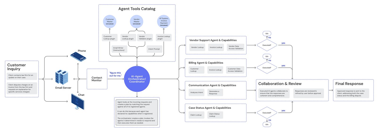
Custom software solution where Agentic transforms the landscape by deploying autonomous AI agents, automating research, data verification and response drafting. By integrating Semantic Kernel for contextual reasoning and retrieval-augmented generation (RAG), the system ensures accuracy while maintaining human oversight.
system metrics
70↓(%)
Dispute processing time
40↓(%)
Error rate in responses
30↑(%)
Customer satisfaction
25↑(%)
Operational cost savings
my role
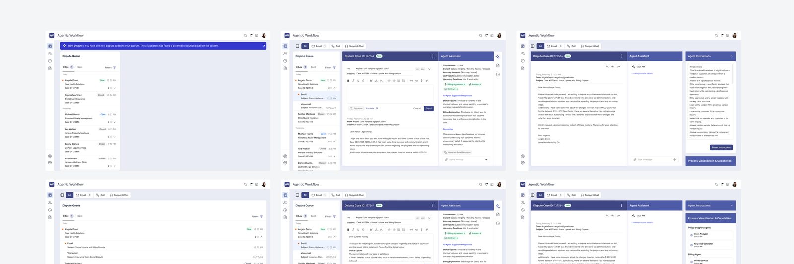
As a Product Designer, I led end-to-end UX strategy, from research and workflow mapping to prototyping and testing. I designed the human-in-the-loop interface that enables dispute adjusters to efficiently review and modify AI-generated recommendations, balancing automation with human oversight.
My work focused on simplifying complex agentic workflows into an intuitive dashboard, optimizing the feedback loop between users and AI.
With insights from the research, a new workflow redefined the division of interaction between AI and humans. Instead of full automation, I designed a collaborative process where AI agents act as a research assistant. Data and AI team identified critical handoff points where human oversight was non-negotiable, such as high-value disputes or ambiguous cases, ensuring AI enhanced rather than replaced expertise.
envisioning the workflow, 0 to 1
Early sketches and rapid prototyping (AI draft vs. human edits) explored different ways to visualize AI's contributions. The winning approach was a dynamic workspace where users saw AI-generated drafts alongside the supporting evidence, with the ability to accept, modify or request deeper analysis.
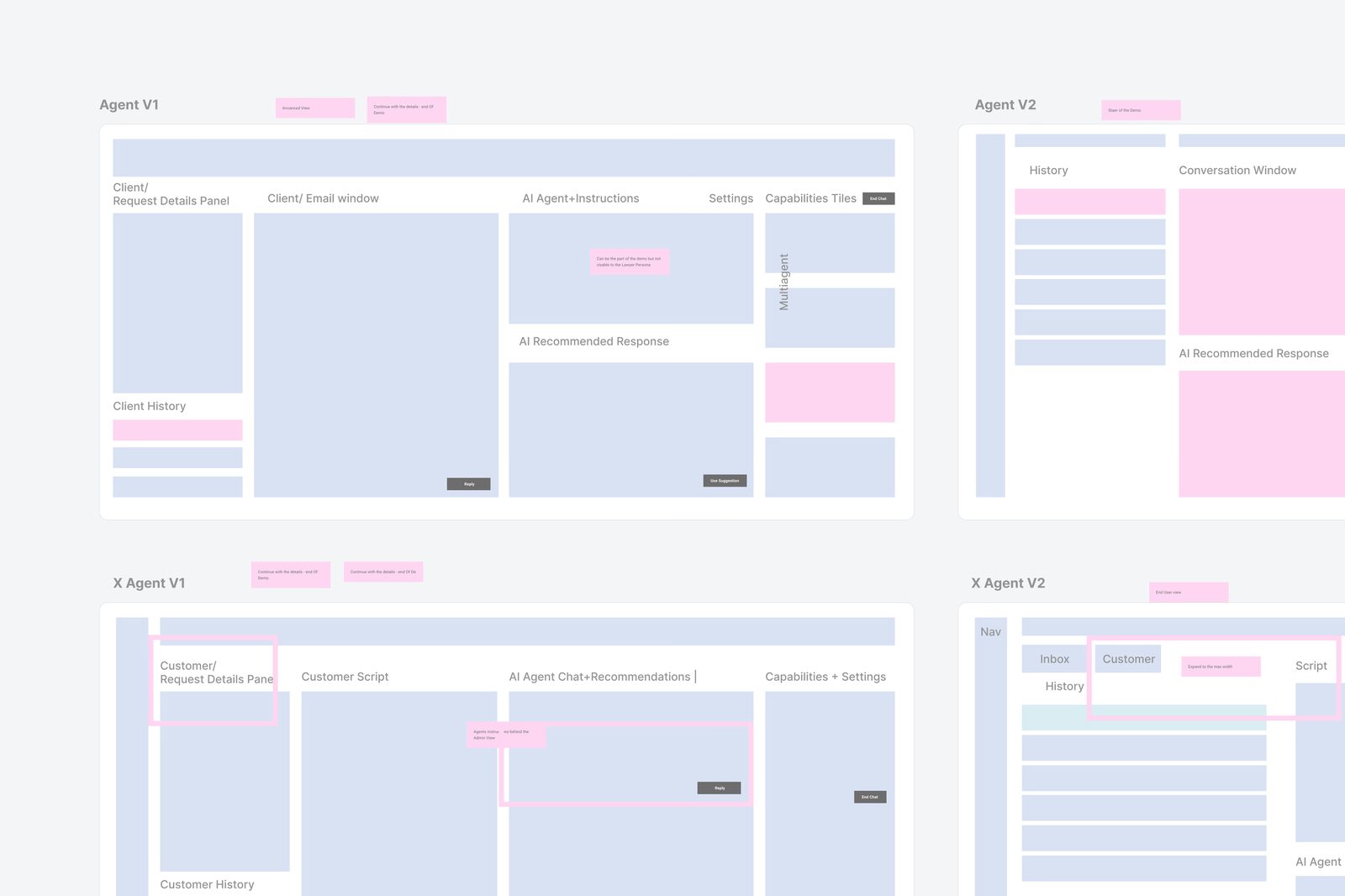
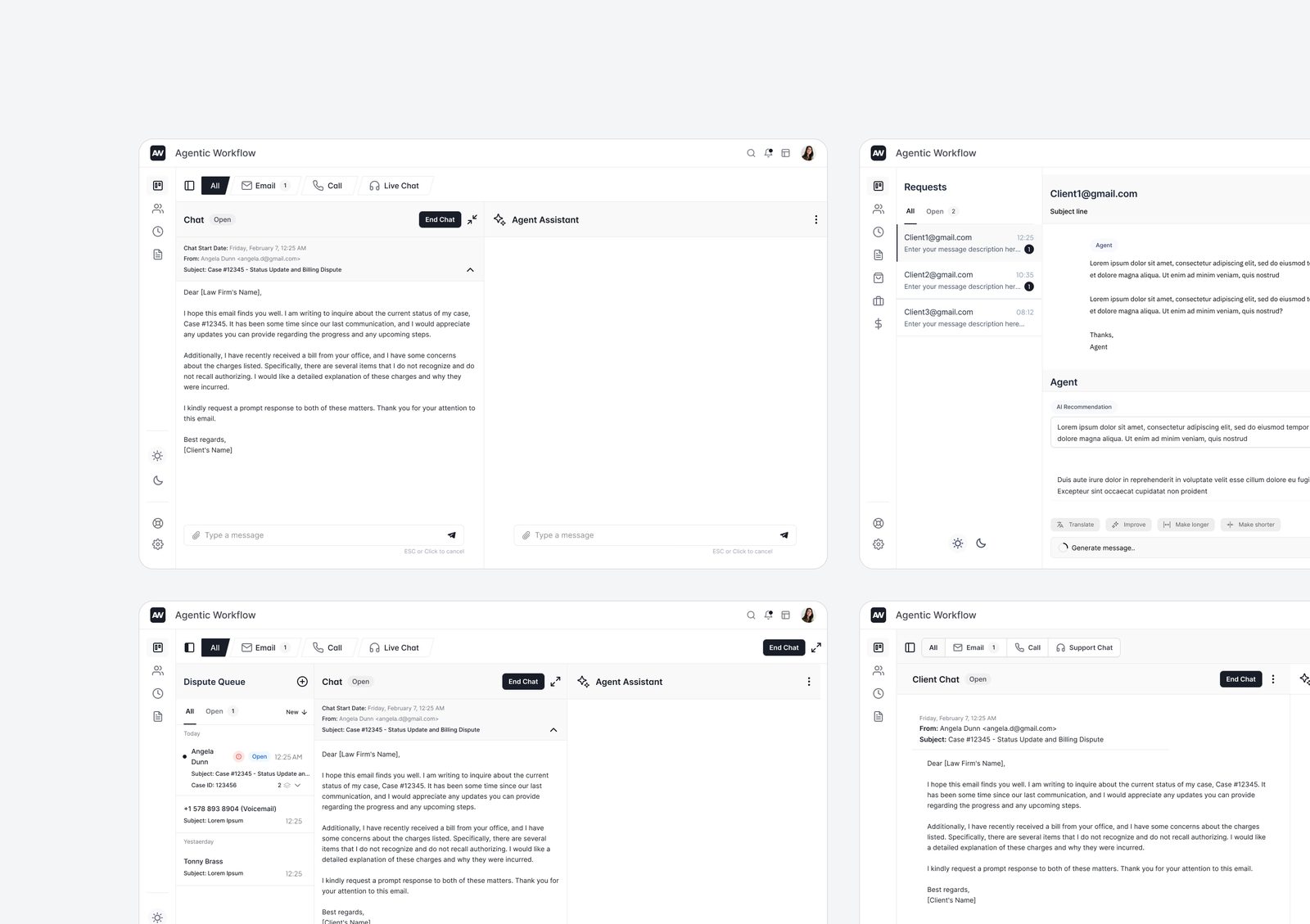
Looking forward, the architecture is designed for adaptability across multiple sectors including healthcare claims and financial disputes, with potential to expand into contract analysis and litigation support.
final design
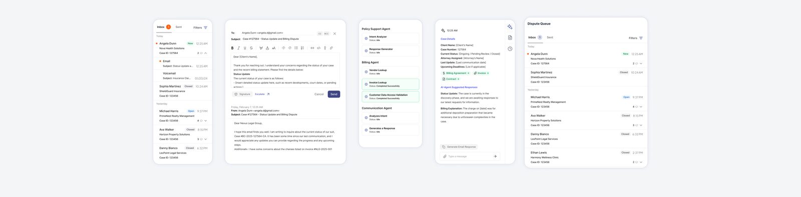
Unlike simple chatbots, this agentic approach creates a truly collaborative workflow where AI handles data-intensive tasks and humans focus on client's experience. The platform features intuitive interfaces that guide users through the review process, provide complete audit trails and incorporate continuous learning from user feedback.
hi
I'm a product (software) designer and lifelong learner, currently building Ontra Agent. I've spent 10+ years solving complex design problems and improving workflows, helping product teams make clearer decisions before they commit significant resources.
Product development is a team sport.
experience
Ontra
Senior User Experience Designer
2025 — 2026
IBM
Senior Product Designer
2023 — 2025
SureCo
Senior User Experience Designer
2020 — 2023
Wellnuts Creative Group
User Experience Designer & Researcher
2018 — 2020
NewtonLabs
Digital Designer
2013 — 2016
Everywhere
Art Kid
∞
how I think
ground in people
Keep real user contact in the loop while AI speeds up synthesis.
logic x emotion
Clarity without feeling is cold. Feeling without clarity is noise. The most powerful interfaces live between both extremes.
ux trust
Help users learn when to rely on the system and when to use their own judgment.
systems
Workflows outlive products. The mapped system outlasts every interface rewrite.
connect